Case Study UX/UI
Paw Tracker
Research and surveys

The most impressive fact was that about 300,000 pets go missing each year in Germany. At the same time our survey showed that the most important for pet owners it’s safety of their pets. And the most useful feature for them is to have live location of a cat or dog.

I had only two weeks to conduct full-fledged UX research and create a design in Figma.
At first, I spent a lot of time to find a topic to work on. I’m going to skip the description of this process and go straight to the theme I chose and you could see in the main photo for this page.
My focus was to create an app for pets.
I conducted secondary research and did a lot of interviews with pet owners. Of course, I got a lot of findings. Crucial of them you can see below .
Well, now that I have some interesting information and we can move on. The next step is to create an affinity map to better understand the overall picture I have got.

So I decided to focus on a tracking feature. For sure for this kind of app we need to have a physical product. But given that we are learning, let’s imagine that we already have such a product, and our task is to develop good functionality for the application.
Since I am studying in Germany, I decided to focus on the German market and found several competitors.
When analysing competitors, it was important for me to see what kind of functionality they have. I made a simple table to see the current situation.

So meet the User Persona Luna Neumann, a young german professional living in Grunewald in Berlin.
She has the dog Lulu and for sure she loves it so much. Thats why her qoute sounds:
I have so many things to do, but I always have time for!


The next part of the UX research is my favorite. This is the moment when you get to know your consumers very closely and literally synthesize the full picture of their life. From the moment the users start their morning through their pains, problems, joys, and successes, right up until the night when they go to bed in a good or in a bad mood.
So, the problem is that Luna sometimes works at office, so she can’t be with the dog the whole time. At the same time we remember that they live in a private house in Grunewald, so her dog is used to having much freedom in actions. Sometimes Luna also allows her dog to go outside and walk by it’s own. And once she came back and didn’t find her dog on house area. A dog found an opportunity to go away for having fun, but for Luna it was a disaster. The story has happy end, the dog came back, but Luna went to sleep with an anxiety inside.

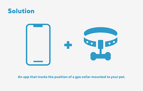
So meet our Problem Statement, How Might We question and our solution as well.

Our task was to create a design for a native App. We chose iOS, because we both use it in our lives.
Next steps were to create Site Map, Low-Fi and Mid-Fi user flow. I don’t show here Low-Fi because it’s on paper and it’s pretty messy 😅
So you here you can see overview on features that we decided to put in our app. But wait for Hi-fi, it will be more interesting 😇


A moodboard is a visual collage that typically includes images, textures, typography, colors, and other visual elements that reflect the desired look and feel of a project.
Moodboards are often used in UX/UI design as a tool to help designers communicate and establish a visual direction for a project. And at the same time for me it’s really a pleasant part of work. I do believe that on moodboard depends a lot, because how you start is how you finish.
Thats why we put a lot of effort to find the best colour palette, pictures and typogrophy.

The pros and cons of Neumorphism

For this project, we decided to use neumorphism. When I first saw this style, I was really impressed by its simplicity and at the same time something futuristic.
We worked on it few days without stops, just to reach ideal shades and floating effect.
The main benefit of this style is the “freshness” (at least for as long as it lasts). It brings that “new feel” to the interface and make it stand out.
It can also be mixed with other styles, so it’s not overwhelmingly “soft extruded plastic” everywhere.
There are however some problems with it that need addressing.
Two main problems are:
-
Accessibility
-
Ways to efficiently code this
-
Difficulties in putting all the elements of UI into this style

Since we are designers, the second point did not concern us in this task (sorry developers🤭).
But the third point affected us very much. We realized that not all interface elements can be designed in this style.
The main point of this style is the same background color and element. Elements become visible only because they are shaded from all sides. So when we put a button on the map, our neumorphism breaks down. In such cases we reworked a style, so that it would not look weird.
And in the end we had such attributes for our brand. For sure it can be developed better, but we decided not to spend a lot of time on this stage, but to pay more attention to our Hi-Fi screens.
PROTOTYPE
Our task was to have a place for designing graphs. This was generally one of the main challenges to learn how to do in on Figma. That’s why on our Hi-Fi-screens you see a lot of dashboards.

So, in our UX part we tried to engage with potential users, understand can the needs and frustrtions of pet owners. To find out the features that like to have. And in UI part we struggled to create user-friendly and intuitive design, so that users could make it easy and enjoyable to use.
I will be grateful for the feedback!