Case study: E-Commerce for small business in Berlin
To find a local shop with potencial for design thinking was not so easy. Additional a lot of people have already functional online store, because almost everybody understands the power of digital advantages for business.
For our team project we found Luciana and her small shop Taba Brasiliera in the heart of Neuköln. She bakes traditional cheese bread balls from Brazil and it’s her main product.
Visiting Taba and having interview


Firstly we had some pre-work before going to her. We did market research to understand how it works in Berlin with small traditional shops. Then we focused on preparing interview-guide for Luciana.
So during visiting we discovered a lot of interesting things about her values, work flow, customers and competitors. This knowledge helped us on all the stages further. Also we physically touched and tasted the product we work on as you can see on the second picture.

Problem Statement and HMW
So after research and interview people who are involved, we created two problem statements.
The fisrt one is connected to customers’ goals:
№1


№2


So we decided to create the online store for Taba Brasiliera, for deskpot and phone version as well. But before we made up our minds with different important things.
Competitor’s matrix,
User Persona and Journey

Although there is a direct competitor solely focused on cheese balls, our product can be found in numerous stores. Therefore, we have listed all of the stores that carry our product.
We conducted a comprehensive analysis of our competitors, examining various categories: presence of physical and online store, own production facilities, B2B and B2C models in business etc.
This analysis provided us with a deeper understanding of our client's position in the market.
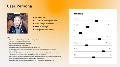
It was important for us to emphasize that our User Persona cares about sustainability, permaculture and organic produce. She believes in supporting small businesses.
She usually buys the fresh cheese balls and eats them the same day and sometimes she buys the frozen ones for her family to eat the weekend (kids and husband).
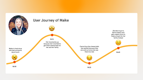
In our User Journey we showed that sometimes when she stays at work late and goes to Taba afterwards, there are no more cheeseballs left. So our online store is supposed to decide the problem.
Moodboard
Creating the moodboard was very enjoyable. At this stage, you work to create an overall picture of the brand, convey the mood and inspire.
Our attritubues are clear: “Homemade” and “Close to natur”.
And the phrase that doesn’t describe our brand is “mass market”.

Mid-Fi Prototype
Maybe the first iron rule which I learned in UX/UI is not to jump as fast as possible into Hi-Fi. Creating Mid-Fidelity prototypes before High-Fidelity prototypes in UX/UI design is important because it allows designers to quickly explore and test different design ideas, interactions, and flows at a relatively low cost.
By validating design decisions and user feedback at the mid-fidelity stage, designers can make informed decisions on how to improve the design before investing more time and resources into the high-fidelity prototypes. This can also help to ensure that the final product meets the needs and expectations of the end-users, resulting in a more user-friendly and effective design.


Few elements from the Mid-Fi

When we created our first prototype we got a lot of insights, that helped us to remake the user flow.
Hi-Fi Prototype
After much effort and work, we were finally prepared to embark on our Hi-Fi screens. Despite encountering numerous challenges along the way, we were able to overcome them and produce a final result that was more than enough for the second school project.
Thanks to the mid-fi testing, we received valuable feedback that enabled us to identify and avoid any major errors or oversights.
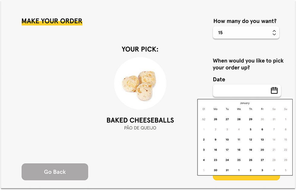
Although we didn't have a lot of things in our design, one interesting element that we implemented was a timer that displays the remaining time until the next batch of cheese balls is available for pickup at the store. We decided to work on this feature after observing that many customers were unable to purchase their desired cheese balls due to arriving too late or too early at the shop.

Shop User Flow
The process of purchasing should have been simple and straightforward, considering that we offer only two products. Therefore, our website should have provided a fast and convenient way to buy our customers' favourite cheese balls.


My learnings
For me, the biggest challenge was communication in team and struggles on finding one solution that would suit everyone.
Sometimes I felt that I would have done things differently, but in order to achieve our main goal, I sometimes moved away from my subjective perception.
This is a good reflection of the UX/UI designer’s work in general — to build your work in a balanced way. Have not only your professional view, but also listen to the opinions of stakeholders and, most important, pay a lot of attention to findings from interviews. Because it has no sense to create something if it doesn’t cover the needs of our audience. And for sure to listen to other team members.